Die meisten Tech-Unternehmen machen 80 % ihres Website-Relaunches richtig. Die fehlenden 20 % entscheiden darüber, ob die Seite konvertiert, Enterprise-Käufer überzeugt und die nächste Finanzierungsrunde unterstützt.
Dieser Artikel zeigt, wie ein technischer Website-Relaunch auf 100 % kommt. Und wo KI in Design und Entwicklung an ihre Grenzen stößt.
Vier Fehler, an denen Tech-Websites scheitern
Die besten 10 KI- und SaaS-Websites 2026
Vier Schritte zu einer Website, die tatsächlich konvertiert
1. Starke Marke vor schnellem Template
Der schwierigste Teil einer Tech-Startup-Website ist nicht das Layout. Es ist die Frage, wie ein zehnköpfiges Team neben tausendköpfigen Platzhirschen Enterprise-tauglich wirkt, wenn jedes Startup dieselbe serifenlose Sans und dieselbe Fintech-Palette nutzt.
Mit einem Template lässt sich das nicht beheben.
Eine starke Marke macht zwei Dinge gleichzeitig. Sie signalisiert dem Käufer, der ein Budget freigibt, Ernsthaftigkeit. Und sie signalisiert dem Investor, der diese Woche schon zehn Decks mit demselben Value Prop gesehen hat, Differenz. Verfehlt die Marke das, wirkt die Website entweder zu klein für das Produkt oder zu generisch, um in Erinnerung zu bleiben.
Genau diese Ebene überspringen die meisten Relaunches. Teams springen zu Wireframes und Webflow, bevor sie die Marke prüfen. Das Ergebnis: eine schnellere Version desselben Problems.
2. Inhalt und Struktur
Wireframes sind nicht nur ein Designschritt. Sie sind der Schritt, an dem Absprungraten entstehen oder verschwinden.
Inhalt und Struktur sind das A und O: Was steht auf der Homepage, in welcher Reihenfolge, mit welcher Hierarchie, wie ausgedrückt.
Wireframes sind auch der Ort, an dem sich SEO-, AIO- und GEO-Arbeit entscheidet. URL-Struktur, Seitenhierarchie, wo Long-Tail-Keywords sitzen. KI-Agenten liefern Inhalte mittlerweile in einem mehr oder weniger ansprechenden Format. Aber „mehr oder weniger" reicht nur für Mittelmaß. Und Mittelmaß bewegt weder Umsatz noch Wachstum.
Und Mittelmaß bewegt weder Umsatz noch Wachstum.
Exzellente Websites entstehen aus Experten-Logik, emotionaler Intelligenz und menschlicher Kreativität. Genau das fehlt KI-Outputs.
3. Illustration und Motion als Teil der Marke
Der schnellste Weg, wie jedes andere KI- oder SaaS-Startup auszusehen: generische Templates, Standard-Screenshots und KI-Prompts für Hero-Bilder, die nach Beginner schreien.
Eigens für die Marke erstellte Illustrationen und Motion-Design leisten, was KI-Bilder und Templates nicht leisten. Sie zeigen Investment in die eigene Identität. Sie zeigen Professionalität. Ein eigenes Illustrationssystem gibt der Website einen visuellen Blickwinkel, der in Blog, Social, Sales Decks und Produkt-UI weiterlebt. Motion gibt dem Auge Rhythmus und sagt ihm, wohin es schauen soll. Zusammen entscheiden sie oft darüber, ob sich eine Website durchdacht oder zusammengebastelt anfühlt.
Das ist wo skalierbare Designsysteme auf Basis von KI-optimierten Brand Guides den Unterschied ausmachen.
4. Reibungslose Navigation und menschliche Logik
Eine schöne Website, die vier Sekunden lädt, ist eine langsame Website. Ein perfektes Design mit kaputten Ankerlinks ist eine kaputte Website.
Der letzte Teil eines Relaunches ist fast komplett Entwicklungsdisziplin: Performance-Budgets, Bildoptimierung, sinnvolle Webflow- oder Framework-Entscheidungen, echte Accessibility statt Plugin-Badge, funktionierende Formulare, ein CMS, das das Marketing-Team ohne Engineer bedienen kann.
Gründer unterschätzen, wie viel vom Markenerlebnis hier drinnen steckt.
Und Teams überschätzen oft die Fähigkeiten der KI.
Null Reibung ist keine Bonus-Phase. Sie ist eine Constraint, gegen die das Design von Anfang an gebaut wird. Und sie verlangt ein starkes Backend.
Vier Fehler, an denen Tech-Websites scheitern
Auch wenn du diese Reihenfolge befolgst, kann ein Relaunch scheitern. Diese vier Fehler sehen wir bei technischen Websites am häufigsten.
1. Überladene Homepage
Ein User entscheidet in etwa fünf Sekunden, ob er auf der SaaS-Website weiterscrollt. Wenn drei Feature-Listen, zwei Produkt-Claims und vier CTAs um diese Aufmerksamkeit konkurrieren, gewinnt keiner. Ein klarer CTA above the fold. Ein ATF, das den Produktwert sofort transportiert.
2. Kompliziertes Sign-up
Lange Formulare, Pflicht-Kreditkarte, vierstufige Trial-Flows. Das sind die teuersten UX-Entscheidungen, die eine SaaS-Website treffen kann. Frag nach dem Minimum, das nötig ist. Biete Trials ohne Kreditkarte, wenn das Geschäftsmodell es zulässt. Vereinfache das Sign-up mit Google- und Slack-Login.
3. Komplexe Preise
Zu viele Stufen, Details in Dropdowns versteckt, kein visuelles Signal für den empfohlenen Plan. Begrenze die Auswahl. Hebe den meistgewählten Plan hervor. Zeige Features in einer Vergleichstabelle nebeneinander.
4. Keine Trust-Signale
Kundenlogos, namentliche Testimonials, Fallstudien. Das ist kein Visual Noise. Das ist der Unterschied zwischen einer schönen Website und einer schönen Website, der ein Käufer mit begrenztem Budget vertraut. Drinlassen.
Die 10 besten KI- und SaaS-Tech-Websites 2026
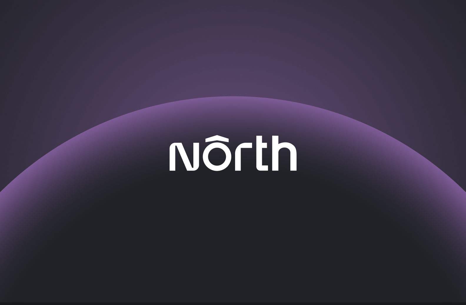
north.cloud
North kann Dark Mode, ohne dabei schwer zu wirken. Klare Fintech-Struktur, einfach zu lesende Typografie, durchdachte Mikro-Interaktionen. Stärkster Move ist der „Before North / With North"-Vergleich: gleicher Kunde, gleiche KPIs, Zahlen sprechen für sich. Das SaaS-Branding ist eines der besten der Kategorie.
webflow.com
Der Held ist das Produkt. Die H1 sitzt in einer Live-Nachbildung der Webflow-Designer-Oberfläche, eine reibungslose Scroll-Animation führt User hindurch. Du verstehst das Produkt, bevor du ein Wort gelesen hast. Weiter unten leistet der „Für wen ist Webflow?"-Abschnitt, was die meisten Enterprise-SaaS-Sites verkomplizieren: ein Dropdown lässt Designer, Entwickler, Marketer und Enterprise-Teams ihren eigenen Pfad nehmen, statt alle durch denselben Homepage-Funnel zu pressen.
sanity.io
Das ATF ist ausdrucksstark, auch wenn er beim ersten Scroll etwas zu viel wirkt. Was wir lieben, ist der Abschnitt „Alles, was dein Team braucht, an einem Ort". Er mischt Sanitys Branding-Elemente mit der echten Produkt-UI. Die Marke dekoriert das Produkt nicht. Sie ist im Produkt drin.
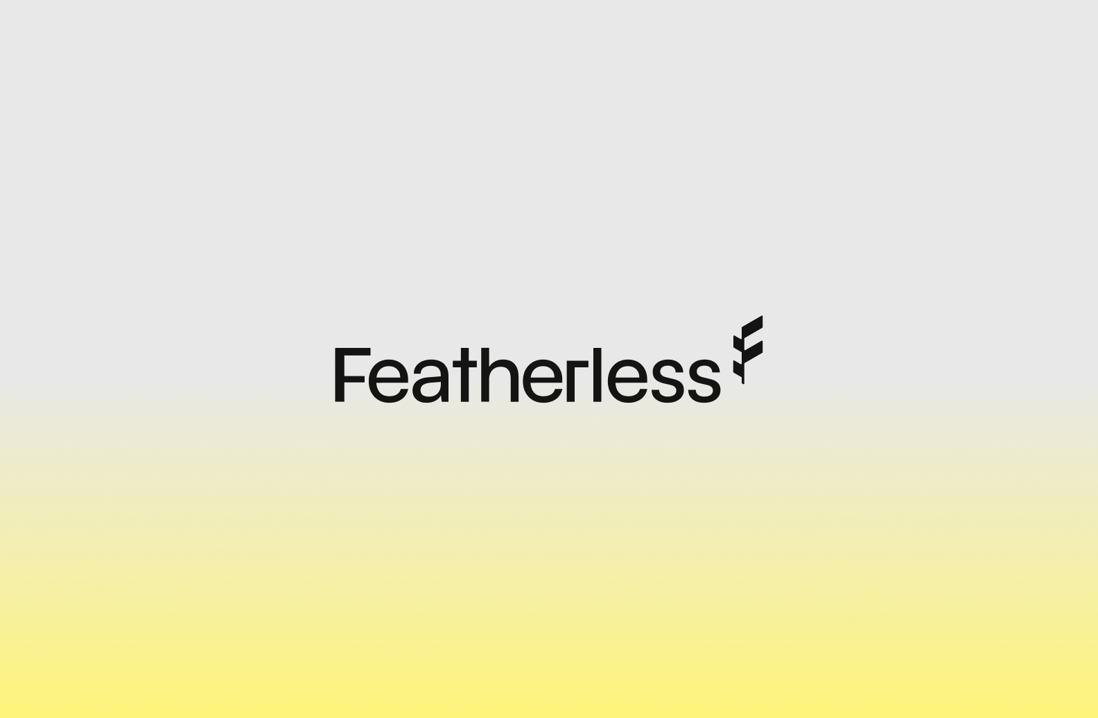
featherless.ai
Mit dem Rebrand Anfang 2026 i Featherless seine Brand-Story rund um Origami. In einer Kategorie, die von Tech-Specs besessen ist, fällt das auf. Passend zum Namen fühlt sich die Website schwerelos an: viel Weißraum, ein klarer Value Prop, kein Lärm.
inceptionlabs.ai
Inception öffnet die Homepage mit einer funktionierenden Chat-Oberfläche, keiner vereinfachten UI. Besucher sehen echte Prompts, echte Streaming-Responses. Für ein KI-Unternehmen, dessen Pitch Geschwindigkeit heißt, ist das die einzig richtige Entscheidung. Der klügste Abschnitt sitzt weiter unten: eine Animation, in der das Mercury-Modell gegen ChatGPT antritt. Mercury generiert Tokens parallel, während ChatGPT „The Quick Brown Fox" Wort für Wort durchkriecht. Aus einem architektonischen Unterschied wird ein klarer Value Prop, den auch nicht-technische Besucher auf einen Blick verstehen.
descript.com
Der ATF gibt einen direkten Einblick in das KI-Editing-Tool, gerahmt in Markenfarben, die du sonst nirgendwo in der Video-Kategorie siehst. Texte sind unterhaltsam, fast verspielt („Mach dir nicht die Mühe, aufzuräumen. Descripts KI schrubbt deinen Hintergrund weg."). Klingt überhaupt nicht nach dem Rest des Markts. Descript schreibt, wie sich das Produkt anfühlt: Video bearbeitet wie ein Dokument, geschrieben wie ein Dokument.
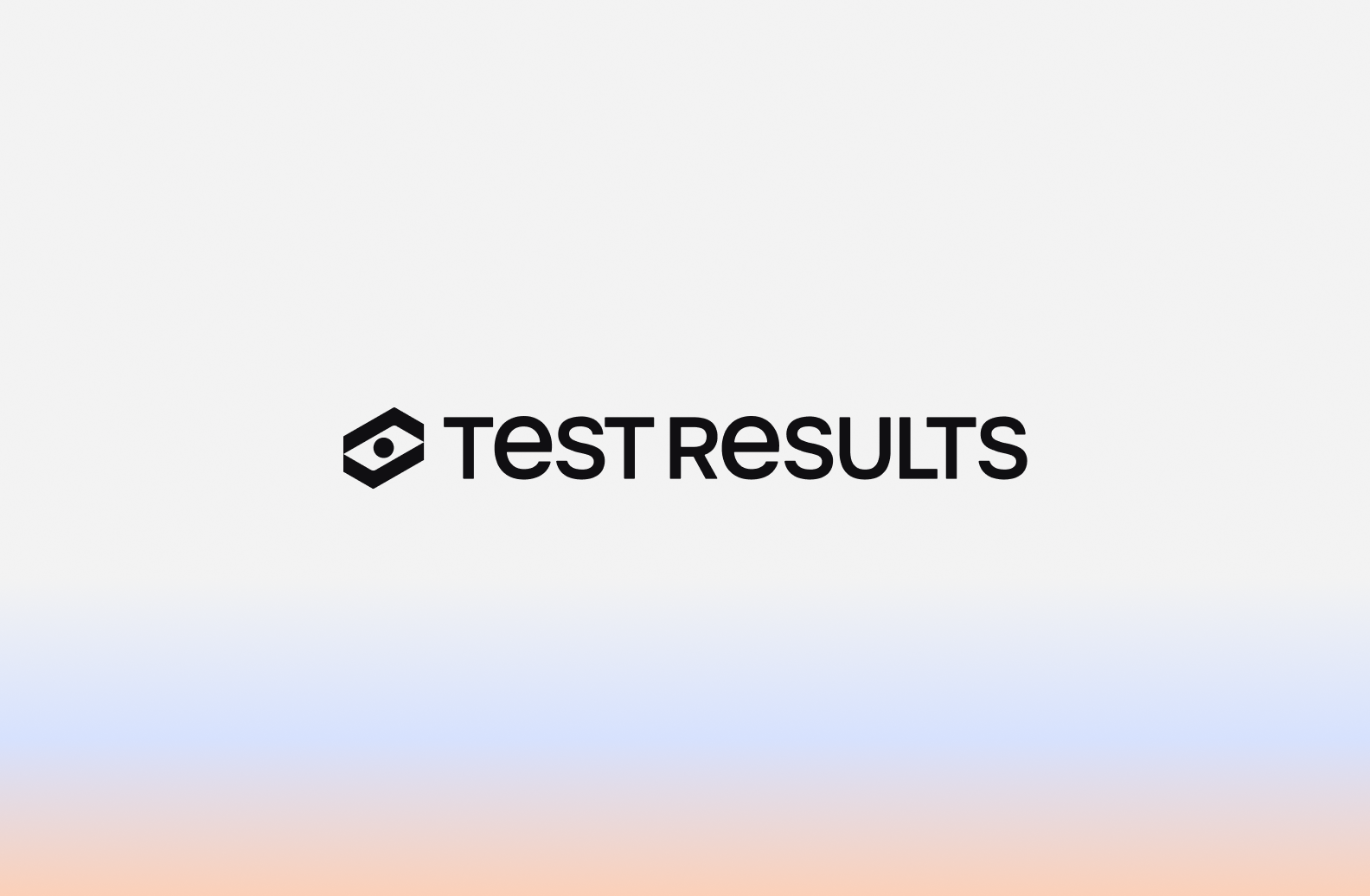
testresults.io
Ein Software-Testing-Tool, das das Brand-Narrativ direkt mit dem Produkt verbindet. TestResults hat die Website passend zum Rebrand im April 2026 erneuert. Der Value Prop ist jetzt sofort verständlich. Die Website ist vom ersten Scroll an wiedererkennbar, mit einer konsistenten visuellen Sprache über Hero, Features und B2B-SaaS-Case-Studies. Das H1 („Software-Testautomatisierung, die ein Release tatsächlich überlebt") ist der ganze Pitch in neun Worten. „Tatsächlich" leistet die meiste Arbeit. Es spricht jeden an, der schon einmal verbrannt wurde.
linear.app
Linear ist eine klassische Developer-first-Website. Minimalismus auf höchstem Niveau. Dark Mode, klare Typografie, keine Illustration, keine abstrakte Metapher. Der Hero ist die echte Linear-UI in Bewegung: echte Issues, echte Status, echte Agent-Messages. Alles, von der Farbpalette bis zu den Tastatur-Shortcut-Interaktionen, ist auf das Developer-Publikum kalibriert, das Terminals den Dashboards vorzieht. Diese Website bittet Entwickler nicht, sich das Produkt vorzustellen. Sie zeigt es.
semrush.com
Semrush hat im März 2026 rebrandet. Weg vom langjährigen Orange, hin zu einer kometen-inspirierten Identität mit Pastellpalette inklusive Flieder und Türkis. Die Ansprache zielt auf das oft weibliche Marketing-Publikum. Die neue Website klingt moderner, selbstbewusster. Der Kontrast zu unsichereren Konkurrenten wie Ubersuggest ist jetzt visuell, nicht nur funktional. Ein Rebrand, der Design nutzt, um einen Anspruch in einer Kategorie zu formulieren: das führende SaaS-Tool, nicht die günstigere Alternative.
orbio.work
Orbio ist HR-Tech, das nicht nach HR-Tech aussieht. Die Website baut auf pixeligen, gepunkteten Fotos. Die Hauptfarben sind kräftiges Khaki und Waldgrün. Das Ergebnis ist Start-up-Energie ohne den üblichen KI-Glanz. Eine Marke nutzt erdige Farben, um ihre Identität an den HR-Bereich zu binden.
Was die besten KI- und SaaS-Websites gemeinsam haben
Ein erfolgreicher Relaunch ist keine schönere Version der alten Website. Er ist eine Website, die eine Marke spiegelt, die stark genug ist, um Glaubwürdigkeit zu erkämpfen und sich von Gleichheit abzuheben. Eine Website, die auf jeder Seite eine klare Geschichte erzählt. Die Illustration und Bewegung als Wachstumssystem nutzt. Die schnell und überall funktioniert. Und die das Zielpublikum sofort findet.
2026 glauben viele, dass es nicht viel braucht, um eine Top-Tech-Website zu erstellen, die tatsächlich konvertiert. Deshalb hören manche bei 80% auf. Das tun wir nicht.
Bei The Branx gestalten wir KI- und SaaS-Websites mit Schnelligkeit, Präzision und Hingabe. All das basierend auf einer starken Markenidentität, die Investoren nicht kopieren, KI-Agenten aber tatsächlich lesen können.
Erfahre mehr über unseren KI-Ansatz.
.jpg)